Considering Colour Thinking
- Carl Brown
Colour is all in the mind. It’s our brains response to the stimulus of light that causes this sensation that we call colour. Without life there is no colour. In this post we’d like to share our thoughts on how this phenomenon, colour, shapes the relationship we have with our built environment.
So how as an industry can we can truly embrace the impact that colour has on us?
Community Project with Colour at it’s heart
To truly create a cohesive colour design, you need to put humanity right at the centre:
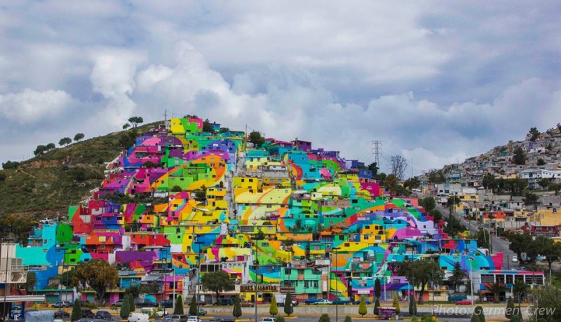
A community art project in Las Palmitas Mexico an area that suffered from high incidents of violent and drug related crimes. Working with social development, crime prevention, sociology, psychology and anthropology professionals they created environments to engage with the community and capture the imagination of the youth. The legacy of these projects has taught the residents skills to maintain the environment and feedback suggests a significant reduction in the rates of murder and related crime.
Could we use insights from case studies like the above as the basis for a new culturally associated colour design movement that inspires and challenges the usual Grey monochrome aesthetic currently in vogue with Architects and Planners?

Historically vibrant colour was used aesthetically in architecture & art to display wealth and symbolise divine significance. Those that adore the classic Greek & Roman sculpture in Marble & Limestone would probably be horrfied to discover that they were originally painted in a riot of colours which leached over the centuries. The myth of classic idealist whiteness was largely a construct of our own culture’s neoclassicist revival in the 18th & 19th centuries.
The movement away from applied pigments toward the use of materiality as colour to highlight pure form, to be Colourless, seems to have become the mainstream of an international modern architecture movement during the 20th Century that to some extent we still see today.
What if we embraced a new way of thinking about colour for our cities where we appreciate and refect the local history and plan for where we want to be?
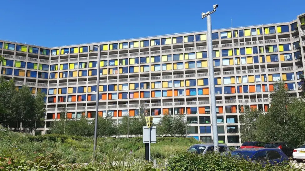
Colour harmonising through each area / building, enhancing a sense of of place and creating a contemporary iconic narrative as we believe the Architects have done to perfection at Park Hills in Sheffield
We at Select love this scheme, it’s genius use of colour contrasts, it’s green credentials essentially repurposing a formerly unloved (excepting hardcore Brutalist Architecture fans i.e. our MD) council ats into a dynamic mixed use development of student blocks, workspaces & apartments

On the scheme above the Architects have used colour combinations influenced by Corbusier to transform a Brutalist block of flats – Park Hills in Sheffield that had deteriorated into a dilapidated slum
Le Corbusier – Architect, painter, planner, writer and the father of modernist Architectural aesthetic played with colour to reconfigure spatial perception, respecting the integrity of his materials and sense of place. His work shows an understanding of the importance of balance and harmony in colour for the built environment.
Our Colour Manifesto
A way of improving the performance of our buildings and spaces through colour, to become more efficient, environmentally attuned and supportive to the wellbeing of their inhabitants. Design is not just something that you build but how you make someone feel. Our feeling is that considered colour planning is essential to the challenges of future design to build well, human-centred places of meaning.
The change only happens with you. This is the start of the conversation and we’d love you to continue the journey with us

