[vc_row css=”.vc_custom_1588856013573{padding-bottom: 32px !important;}”][vc_column width=”1/2″][vc_empty_space][vc_column_text]
Couple of Fabrics Trends for 2020
Two Snippets from Camira Fabrics 2020 Trend Report which provides a barometer of trends for textiles, colours, textures and aesthetics for 2020
Following on from the disruptive ethos of Revolution from last year’s Camira annual Trends report. The coming year’s title and ethos is WHY NOT? The idea is to challenge the norms and encourage designers and specifiers to explore new ideas, instinct and crash through creative barriers
The Report explores four key themes, each section is as follows: Have Fun, Challenge, Be Brave & Be One. The idea is to provoke and nurture the creative spirits by breaking some rules These beautiful images capture a series of stories reflecting the colours in each section. The colours, textures, and palettes can be used to create striking interiors perfectly in sync with the mood of the moment.
The fabrics designed and manufactured in the UK, the report showcases a range of polyester, wool and bast fibre fabric. The Trend Report is researched research by Camira’s Product Development team throughout the year, collaborating with external trend consultants. The annual report has established a reputation as being a source of knowledge, insight and expertise for architects, designers and specifiers across the contract sector. Providing inspiring fabric combinations, palettes and tonal harmonies.
Why not… seeks to stimulate rather than dictate, providing inspiration to create their own approaches and concept.
[/vc_column_text][/vc_column][vc_column width=”1/2″][vc_single_image image=”16424″ img_size=”large”][/vc_column][/vc_row][vc_row][vc_column][vc_empty_space][edgtf_separator position=”center” color=”#bababa” border_style=”solid” width=”50%” thickness=”3px”][vc_empty_space][/vc_column][/vc_row][vc_row css=”.vc_custom_1588856640912{padding-bottom: 32px !important;}”][vc_column width=”1/3″][vc_single_image image=”16425″ img_size=”full” onclick=”link_image”][/vc_column][vc_column width=”2/3″][vc_empty_space height=”64px”][vc_column_text]
01 Having Fun
Have fun is about a wonderfully bonkers approach and encourages a timeless attitude to interior design using dynamic groupings of colour and textural finishes. The essence is to have a child like disregard of matching and neutral and to grasp almost childlike tones and grouping of colours.
[/vc_column_text][/vc_column][/vc_row][vc_row][vc_column][vc_empty_space][edgtf_separator position=”center” color=”#bababa” border_style=”solid” width=”50%” thickness=”3px”][vc_empty_space][/vc_column][/vc_row][vc_row][vc_column width=”1/2″][vc_empty_space][vc_column_text]
02 Subtle contrast
Subtle contrast is a different way of balancing scheme by selecting five dominant accent colours with softer shades to counterbalance and ground the colours. The neutrals can be earthy pastels of pink, mauve, aqua & mint rather than the usual greys. Mix textures for feel with herringbone weaves.
This trend incorporates a variety of textile finishes and as well as the duo-tone and textural fabrics, the Solid colours bring further interest. A smooth felted finish in crimson red (8) draws you into this energising hue, while a soft calming verdigris leather (3) offers an inviting neutral that complements golden yellow (4) and rusty shade (2) to achieve a bold yet inviting space. Link to full Report.
Recent fit out for a Manchester rail provider illustrating colours and fabric combinations, Designed and Fitted Out by Select Interiors. Scope of works extensive demolition & structural works, electrical, data, lighting, partitioning, glazed partitions, plastering, kitchens, W.C.s, mechanical, plumbing, joinery, decoration & graphics.
[/vc_column_text][/vc_column][vc_column width=”1/2″][vc_single_image image=”16428″ img_size=”full” onclick=”link_image”][/vc_column][/vc_row][vc_row][vc_column][vc_empty_space][edgtf_separator position=”center” color=”#bababa” border_style=”solid” width=”50%” thickness=”3px”][vc_empty_space][/vc_column][/vc_row][vc_row][vc_column][vc_column_text]
Using fabrics in office fit out design
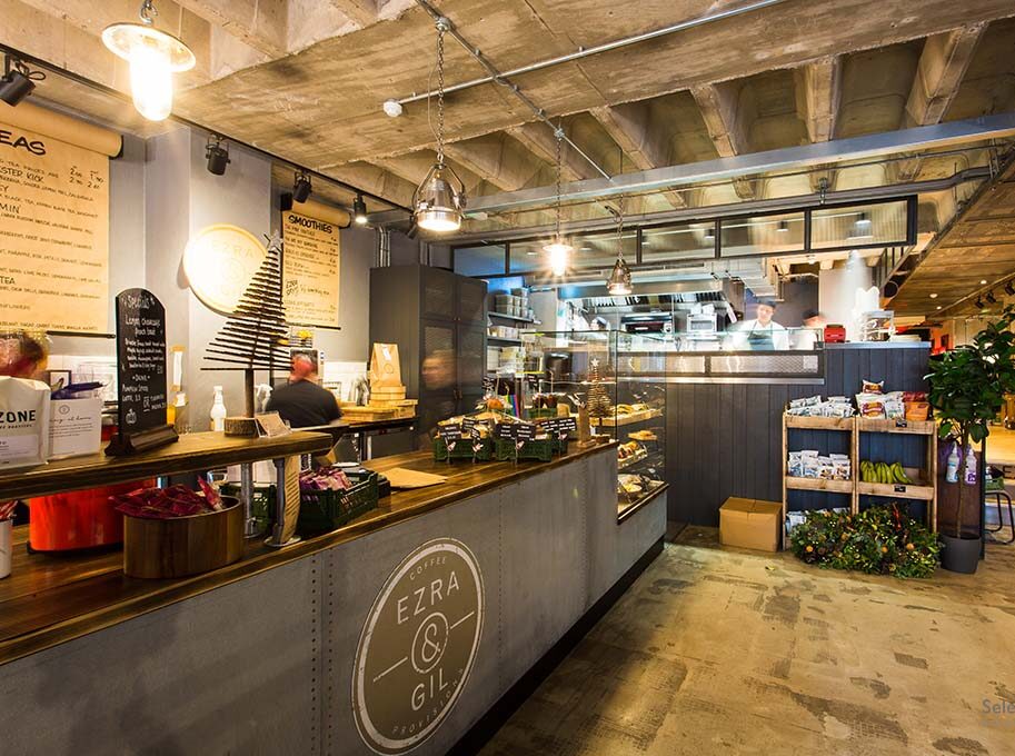
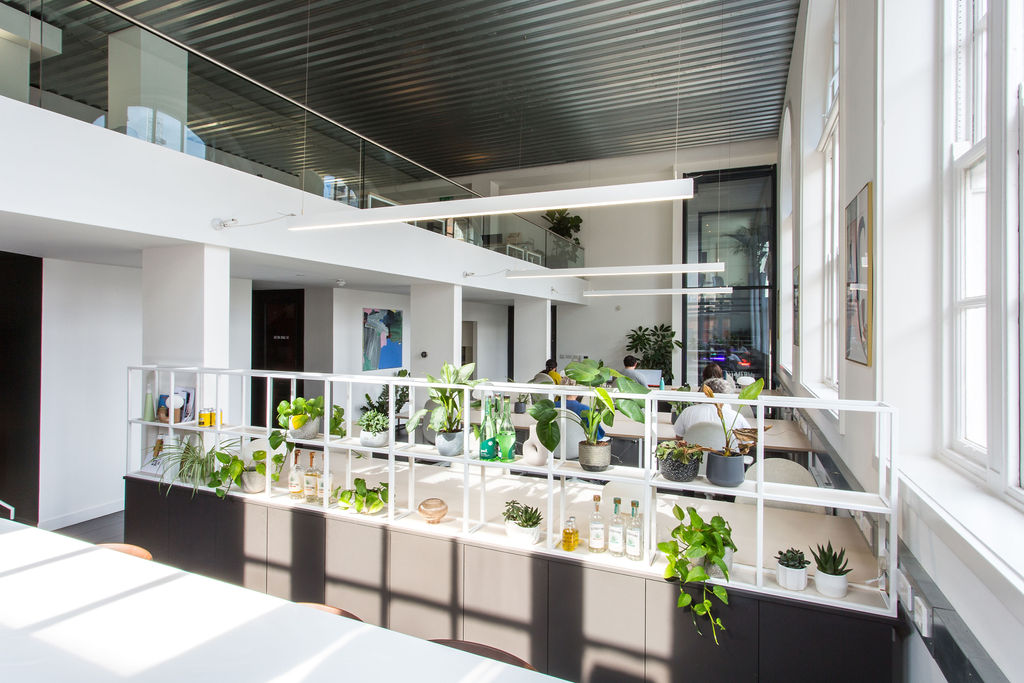
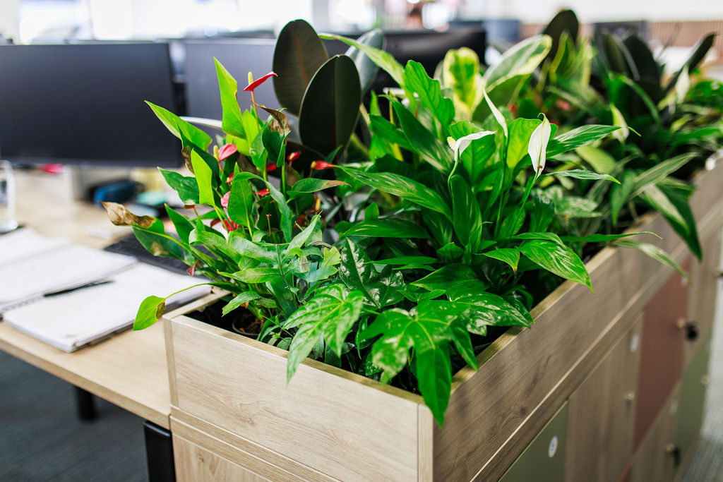
We at Select Interiors Manchester know It makes sense to create office environments that not only make the most efficient use of space but that incorporate a sense of fun and unique bespoke elements to every scheme.
Talk to the experts about how an engaging fit out can improve productivity and well-being to help attract, motivate & improve staff retention call the Select Interiors design team on 0161 445 40406[/vc_column_text][vc_empty_space][/vc_column][/vc_row][vc_row][vc_column width=”1/3″][vc_single_image image=”16408″ img_size=”413×267″][/vc_column][vc_column width=”1/3″][vc_single_image image=”16409″ img_size=”413×267″][/vc_column][vc_column width=”1/3″][vc_single_image image=”16411″ img_size=”413×267″][/vc_column][/vc_row][vc_row][vc_column][vc_empty_space][edgtf_separator type=”full-width” color=”#bababa” border_style=”solid” thickness=”3px”][vc_empty_space][vc_column_text]
Latest Projects…
[/vc_column_text][vc_column_text]We at Select Interiors Manchester Makers & Creators of unique interiors at competitive prices. We design and create environments that not only make the most efficient use of space but that incorporate a sense of fun and unique, bespoke elements to every scheme.
Talk to the experts about how we can improve your office, restaurant, cafe or retail space, call the Select Interiors design team on 0161 445 4040.
[/vc_column_text][vc_empty_space][edgtf_portfolio_list title_tag=”h3″ image_size=”landscape” show_load_more=”yes” order_by=”date” order=”ASC” number=”3″ columns=”3″ filter=”no”][/vc_column][/vc_row]

